
Choosing Colors for Different States
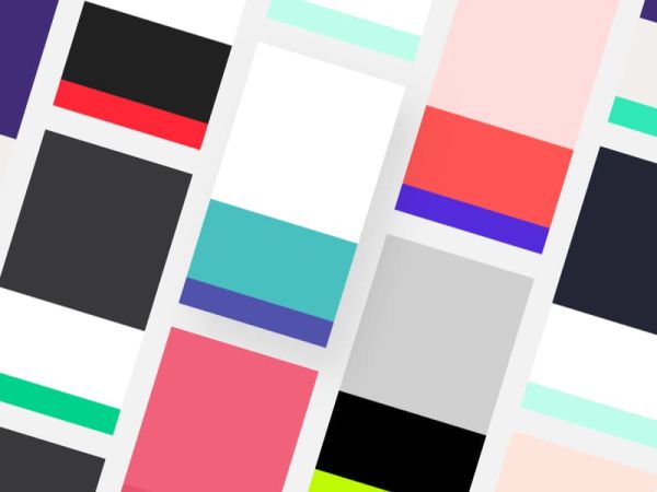
When choosing colors for different states, it typically refers to assigning distinct colors to represent various conditions, statuses, or categories within a system, interface, or dataset. This concept is commonly applied in user interfaces, data visualization, maps, and other visual representations to convey information effectively to users or viewers.
Here’s a more detailed breakdown of how this concept can be applied in different contexts:
User Interfaces: In user interfaces (UI), colors are often used to indicate different states of elements or actions. For example, buttons may change color to indicate when they are hovered over, clicked, or disabled. Similarly, form fields may change color to indicate valid or invalid input. By using distinct colors for each state, users can quickly understand the current status or condition of interface elements, improving usability and clarity.
Data Visualization: In data visualization, colors are used to represent different data categories or attributes. For example, in a bar chart comparing sales data across regions, each region may be assigned a different color to differentiate them visually. Similarly, in a heat map representing population density, different shades of color may be used to indicate varying levels of density. By choosing colors that are distinct and meaningful, viewers can easily interpret the data and identify patterns or trends.
Map Representation: In maps, colors are used to represent different geographic regions, boundaries, or features. For example, different colors may be used to represent different countries, states, or terrain types. Additionally, colors may be used to indicate specific conditions or attributes within each region, such as temperature, precipitation, or elevation. By using a color legend or key, viewers can understand the meaning of each color and interpret the map accurately.
Feedback and Notifications: Colors are also commonly used to provide feedback or notifications to users. For example, in an email application, unread emails may be highlighted in a different color to draw attention to them. Similarly, error messages or alerts may be displayed in a contrasting color to indicate a problem that requires attention. By using colors effectively, users can quickly identify important information and take appropriate actions.
Overall, choosing colors for different states involves selecting colors that are distinct, meaningful, and visually appealing, while also considering factors such as accessibility, context, and branding. By thoughtfully applying color to represent different states or conditions, designers can enhance usability, improve comprehension, and create engaging visual experiences for users.
Different States
Here’s a breakdown of different states commonly encountered in user interfaces along with guidance on choosing colors for each state:
2.1 Hover State
The Hover state is activated when a user hovers their cursor over an interactive element. Choosing a color for this state often involves a subtle change to indicate interactivity. Consider lightening or darkening the base color, or introducing a slight tint to create a visual cue that the element is interactive.
2.2 Active State
The Active state signifies that an element is currently being interacted with. This state is commonly triggered when a user clicks or taps on a button. Choose a color that maintains a visual connection with the base color but adds a noticeable change. This could involve a slight color shift or introducing a border to visually confirm the user’s action.
2.3 Press State
The Press state is activated in response to a user pressing down on an element. This state often involves a subtle darkening or shadow effect, simulating the visual feedback of pressing a physical button. The color should convey a sense of depth and responsiveness, providing immediate feedback to the user’s action.
2.4 Disabled State
The Disabled state indicates that an element is temporarily inactive or unavailable. Choosing an appropriate color for this state is essential to communicate its disabled status. Typically, desaturating the color or using a muted tone helps convey that the element is not currently interactive. Additionally, consider adjusting opacity to further visually distinguish disabled elements.
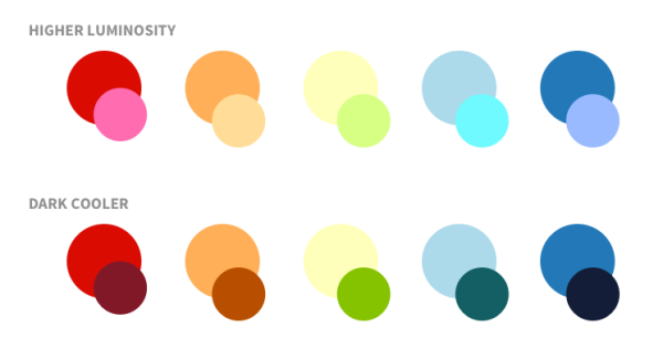
Determining Shades for Consistency
3.1 Maintain Consistency Across States
While selecting colors for different states, it’s crucial to maintain consistency within the overall color scheme. Consistency fosters a cohesive and polished look, contributing to a seamless user experience. Use shades that align with the base color to create a harmonious transition between states.
3.2 Consider User Feedback
When determining shades, consider user feedback and preferences. Conduct usability testing to understand how users respond to color changes in different states. Their feedback can provide valuable insights into whether the chosen colors effectively convey interactivity and enhance the overall user experience.
Tools and Resources for Color Selection
4.1 Color Pickers and Generators
Utilize online color pickers and generators to experiment with different color combinations. Tools like Adobe Color Wheel or Coolors can help you discover complementary shades and ensure that your chosen palette remains visually appealing and consistent across various states.
4.2 Contrast Checkers
To enhance accessibility, use contrast checkers to ensure that your color choices meet the necessary standards. Tools such as WebAIM’s Contrast Checker can help you verify that your color combinations maintain sufficient contrast for users with visual impairments.
Conclusion
Mastering the art of selecting colors for different states in UI design involves a combination of creativity, user-centered thinking, and attention to detail. By understanding the significance of each state and choosing colors that provide clear visual feedback, designers can create interfaces that are both aesthetically pleasing and user-friendly. Experiment with color palettes, consider user preferences, and leverage online tools to refine your color choices, ensuring a seamless and engaging user interaction in every state.
Related Posts

